
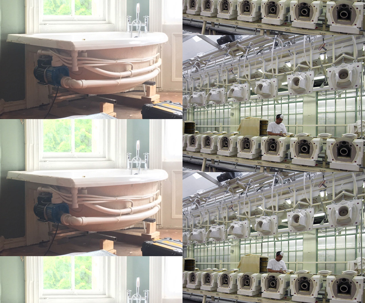
Photos of 'Untitled' - Benjamin Nuttal.
Research images - artist's collection.
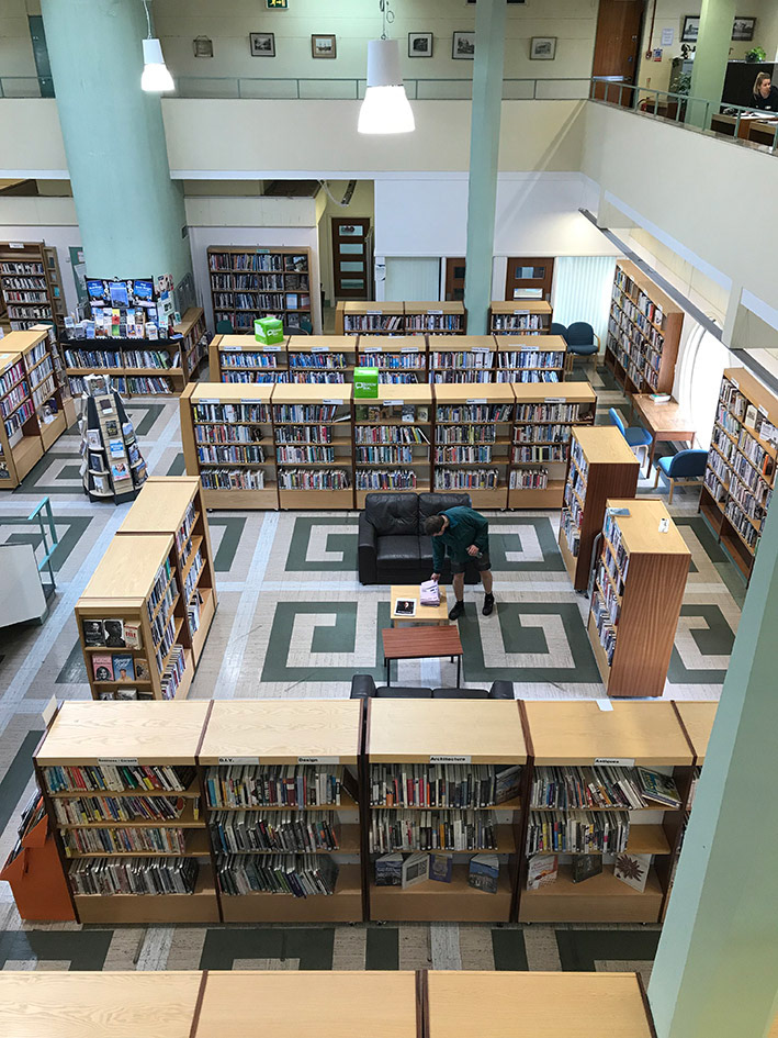
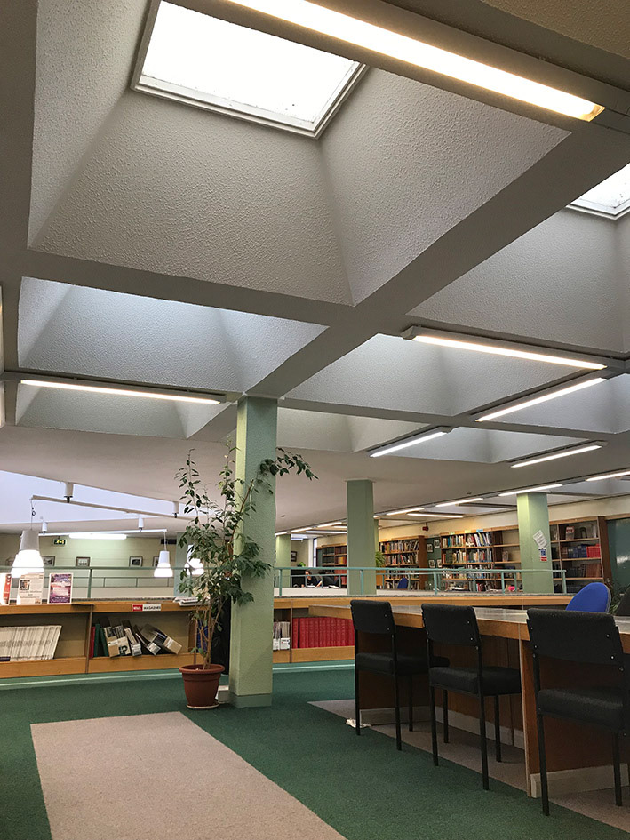
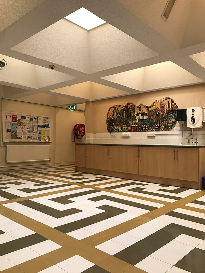
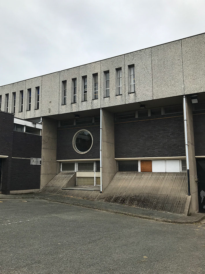
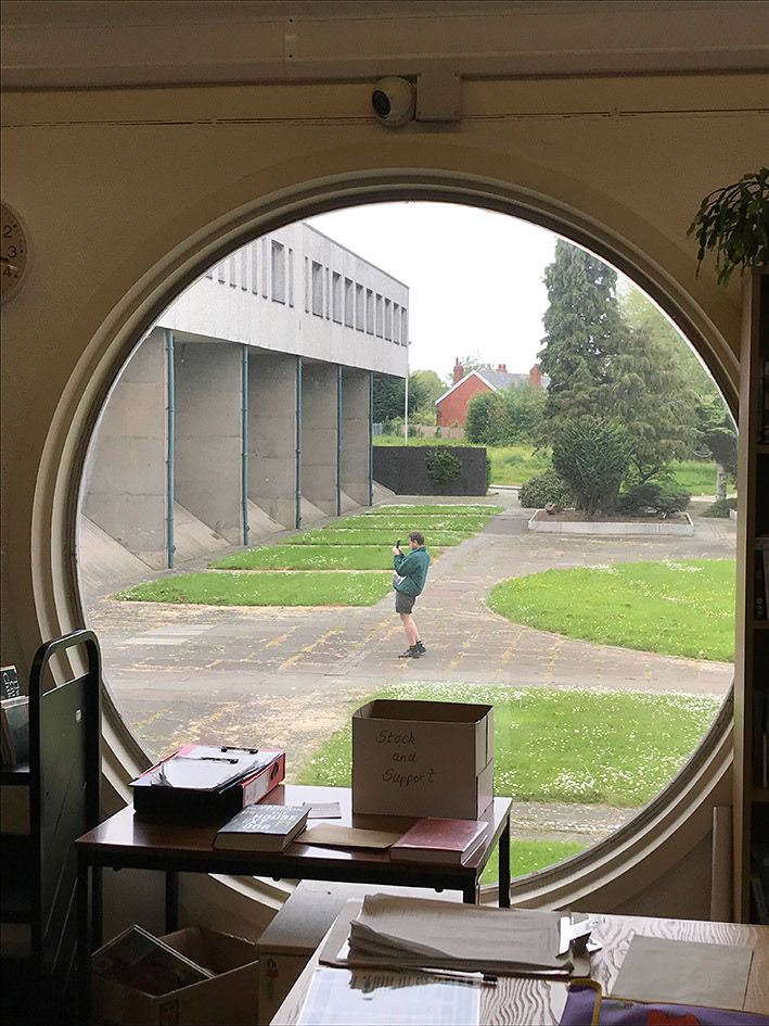
Install shots and Bebington Central Library - Paddy Gould.
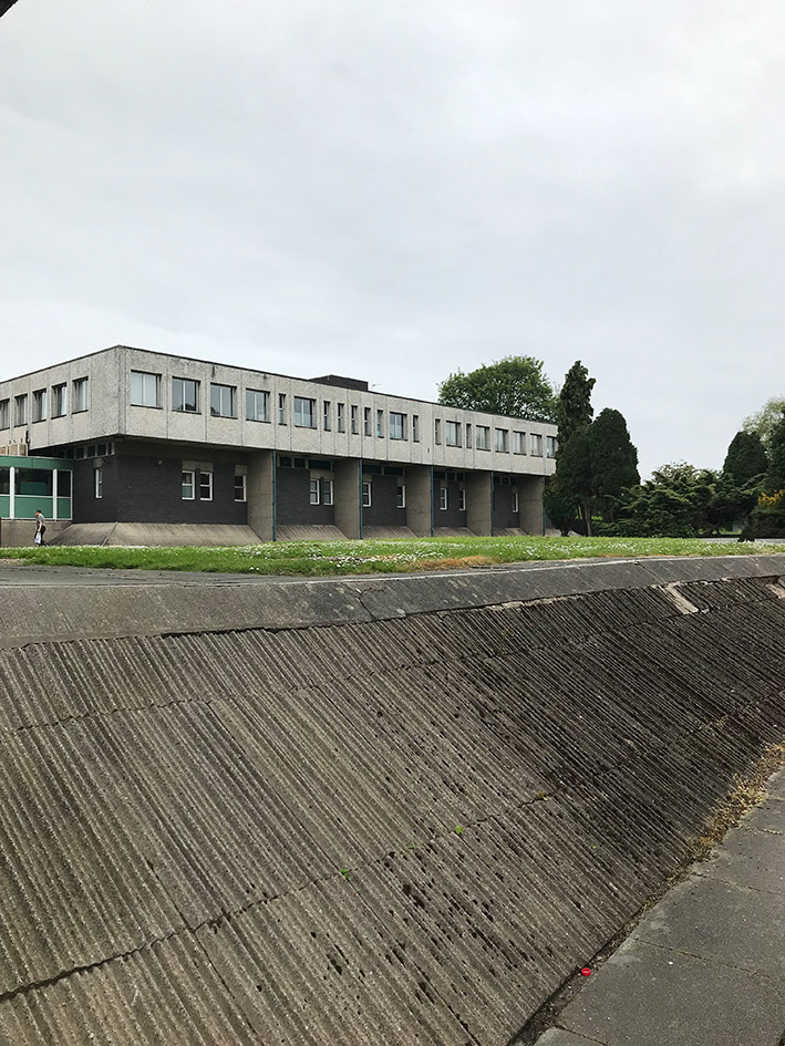
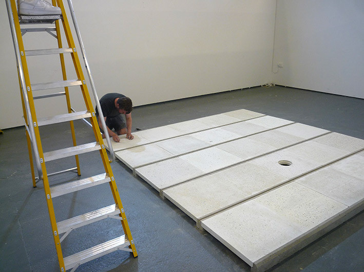
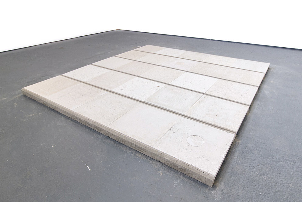
On the verge of finishing a new concrete floor piece (a massive task of cast concrete beams, tiles and hatches) Stephen Forge took us on a day trip to the brutalist Bebington Central Library *. An appropriate spot with its facade of modular concrete panels. We discussed the forms and processes in commercial design and the built environment which go into his work.
PS - It’s funny you’re on the verge of finishing this massive labour, which is this cast floor piece but the last few times we’ve chatted you’ve been excited by a new idea based around kitchen cabinets.
SF - Yeah, I think that’s okay, the cabinets are where my head is at so let’s talk about that.
I’ll make multiples, turning them back to front, so they’re maybe facing each other and you’ve got the backs visible. Or stacking these individual cabinet units, stack, repeat and turn, tessellate, whatever.
This style of cabinet has come out of a purely pragmatic way of making something, that works. There’s an economy to them. So, you’ve got these certain materials of different dimensions and thicknesses depending on their function. For me that language of materials is what's interesting.
PS - And that's all visible from the back of the objects. Which is a viewpoint you picked up making sets for theatre right?
SF - That was what got me back into making work, and I was learning. I was constantly behind everything, seeing all the stuff that the audience doesn’t see. The fronts were often just the thickness of a few mm of ply that had been painted on. It was all just pretend! Whilst the back was a real thing, and there was a lot more to take on.
PS - The last floor piece I saw appeared to be a section of a raised floor just sitting in the gallery, so you were naturally seeing its cross section on the sides.

'Untitled' 2019. detail
'Untitled' 2019. detail
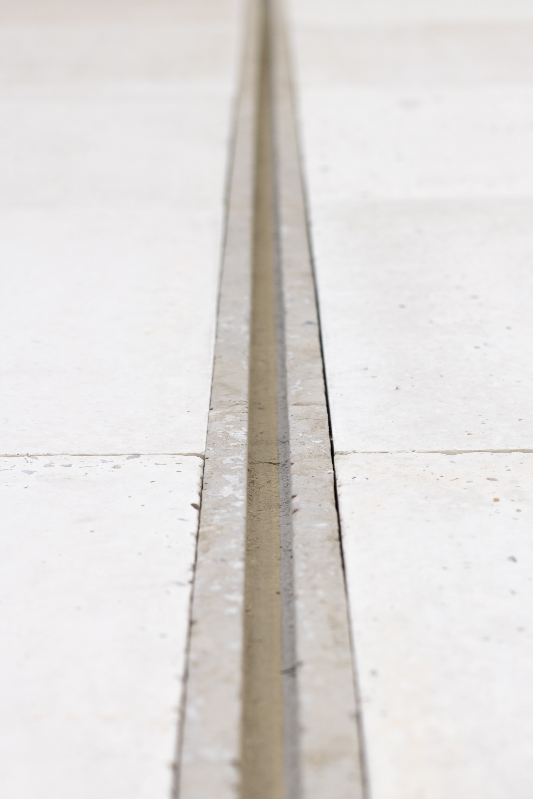
SF - With the floors, the whole work is about the side of the piece. That is the work, the edge.
For me the essentials in a piece are quite a lot of repetition, quite large scale, how the piece is made has to be really apparent and the details of something coming through. Right now, I want to make these large pieces that are systematic, with no outline shape, it’s just a sum of all its component parts and it just gets bigger and bigger and bigger the more you add to it.
PS - You tend to work with components, and multiples of the components. So, there’s a repetition and almost a pattern in the way that they’re put together. Something that’s in industrial design in general.
'Untitled' 2019. detail
Arndale Centre facade, Manchester.
SF - Yeah exactly, or commercial design I suppose. That it is flat pack, made off site and assembled. The components are made separately and they all fit together.
PG - And with some pieces you make a purposeful cut through. In your gallery wall pieces for example, the cut appears to of been made in order to pull something through, to bring power out of it to a tv, or something. So, this natural adaptation allows you to see that cross-sectional diagram.
SF - It’s an area where I always feel like I’m on dodgy ground. When I tried to make gallery walls there were bits chopped out and there were new pieces put in to put the wall back together. There was always this sort of feeling that it was dealing with stuff that you can’t ignore. It’s had a life and you’re using that. It’s the opposite of casting materials, which I like to do. Freshly casted, it’s new to everything.
PS - For me those two things are an interesting pair. That sort of industrial infinity against a worn in individuality. I mean sometimes you have to help along those bits of individuality in order to give the object the cutaway.
SF - When I’ve made work out of things that have got a history, I think in context it had to feel right.
They were gallery walls that I was using and I was remaking them into more gallery walls that I was trying to make work out of. And, to begin with, I am a carpenter that makes gallery walls. It was real enough I think, in enough areas for it to not be theatrical, which is not what I wanted.
'Untitled' 2019
PG – I wanted to ask do you ever feel like the repetition in a piece ever strays over into doing something optical, with the rhythm of it?
SF - Well you know I tried some installations, I made one that went to the three corners of the room and I think the fact that it was part of the space... something didn’t quite feel right about it. I mean it was a nice idea to do but I think they are better off as objects that are taken out of context and put into a space in a more traditional way. So maybe I should have carpeted the whole room and then put a piece of work in there, because I was interested in the carpet.
PS - Laying a carpet is like laying a concrete screed in a way, you’re just pouring or rolling out a floor. It would be like layering two languages together, one of components that suggest a repetitious infinity and one that feels sliced out of infinity.
SF - One that’s fitted. Well I wouldn’t mind designing a whole space, pouring a floor, polishing it then putting one of my pieces in it. That would be amazing, but I don’t have the facility to do it. So, I think I’m better spending more time making these objects and having these groups. So, if I have a solo show there’s three or four pieces, which can sort of inform each other. I think there’s a certain scale that I’m working with and it’s probably about ten-foot square (laughs).
If it gets bigger then it gets too much about the repetition, because the scale of the components goes off. So, the proportions go out, there’s a human scale. That’s what I loved about the kitchen units. The scale was perfect.
If it becomes huge it gets too far away from what the object’s about. All the components become really small in a massive grid. And it doesn’t work anymore.
PS - It's like you’re saying, here’s a pattern, here’s the elements of that pattern, here’s enough to realise it’s a pattern, and then stop.
SF - Yeah, there’s an economy there
PS - So you want to make the minimum amount in order to do it, and it’s rationalised.
SF - Yeah. Cause loads of something doesn’t necessarily mean it’s better. I like sculptors that have a human scale to them. I think Rachel Whiteread’s early works had a human scale to them, they were the size of a room in a house weren’t they, and that was great. So those rooms fitted into a large art gallery. That was a nice thing about them.
PS - Are you interested in that human stuff that’s buried in them? The way that she’s casting this house or this room and you’re getting all this human wear and tear and this history, or the fringe elements of that history?
SF - I like that but I also like that that’s just what you would get if you did it. If you went into a room and cast it, then that’s what you would get.
The soot from the chimney, the dirty marks around the plug sockets, you get what you get. I like all of that because it’s real, it’s a by-product.
-PG and sometimes you seem to want aesthetics to be a by-product of functional design?
-SF With industrial design, it might be kinetic or whatever, so they’re blank components aren’t they, made for a purpose. They’ve obviously been designed, they exist for a purpose, they are still aesthetic but engineered and blank.
I’m trying to consider the aesthetics as little as possible, they are always there but if I say, “right, everything is white”, then the materials become the aesthetics. If everything’s the same colour you can see the different properties clearly. And those subtleties also mean you start looking at the shadows and the spaces between things.
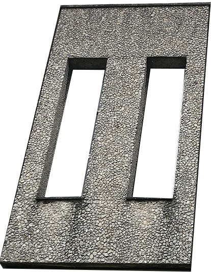
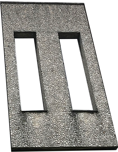
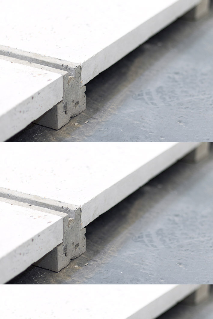
For example, I realised with the last floor piece that by inserting the smaller pieces into the tiles, I had three component parts instead of two, which was such a small thing, but actually felt like a huge thing. And I had to deal with the thicknesses, I expanded the depth of the tile which meant I could set elements into it. So, we have coaster type hatches which appear to have some kind of practical function. So that expansion was the progression in the work, because now I’m looking at everything in terms of a third element which is on a smaller scale but in the same colour.
PS - Right ok, so design wise you've absorbed the holes and repairs from the gallery wall pieces into a changeable element in the design. I guess to me, pattern-wise you’re creating a regular floor system of two parts, the beams and tiles, and then the hatches are an irregular third element which is laid over the top to suit an individual need.
-SF The floor is made now, so that is now a structure to make works on top of by changing tiles, making different hatches and so on. So now I'm making smaller components, more complex hatch elements and that's been allowed by increasing the depth of the tiles to a thickness you could safely walk on.
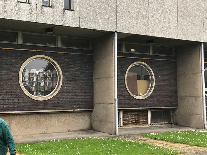
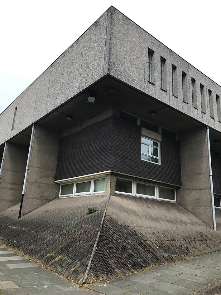
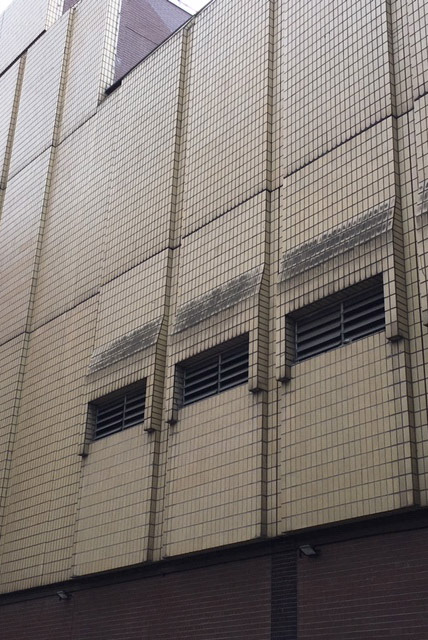
-PS You took me and my Da to Bebington Central Library recently, a brutalist building which sits on a huge ribbed concrete plinth that levels out the uneven site without doing any excessive landscaping.
-SF I wanted to see the library because it uses a very similar language to the floor. The cast concrete panels with some variation which breaks up the symmetry. I also wanted to see how the layers of the different floors relate to each other, for the cabinets I'm working towards. There’s always design and there’s always a designer, so everything I’m looking at has already been designed by someone else. And THEY’ve looked at something else, so there’s a chain.
-SF With industrial design, it might be kinetic or whatever, so they’re blank components aren’t they, made for a purpose. They’ve obviously been designed, they exist for a purpose, they are still aesthetic but engineered and blank.
I’m trying to consider the aesthetics as little as possible, they are always there but if I say, “right, everything is white”, then the materials become the aesthetics. If everything’s the same colour you can see the different properties clearly. And those subtleties also mean you start looking at the shadows and the spaces between things.
For example, I realised with the last floor piece that by inserting the smaller pieces into the tiles, I had three component parts instead of two, which was such a small thing, but actually felt like a huge thing. And I had to deal with the thicknesses, I expanded the depth of the tile which meant I could set elements into it. So, we have coaster type hatches which appear to have some kind of practical function. So that expansion was the progression in the work, because now I’m looking at everything in terms of a third element which is on a smaller scale but in the same colour.
PS - Right ok, so design wise you've absorbed the holes and repairs from the gallery wall pieces into a changeable element in the design. I guess to me, pattern-wise you’re creating a regular floor system of two parts, the beams and tiles, and then the hatches are an irregular third element which is laid over the top to suit an individual need.
-SF The floor is made now, so that is now a structure to make works on top of by changing tiles, making different hatches and so on. So now I'm making smaller components, more complex hatch elements and that's been allowed by increasing the depth of the tiles to a thickness you could safely walk on.
-PS You took me and my Da to Bebington Central Library recently, a brutalist building which sits on a huge ribbed concrete plinth that levels out the uneven site without doing any excessive landscaping.
-SF I wanted to see the library because it uses a very similar language to the floor. The cast concrete panels with some variation which breaks up the symmetry. I also wanted to see how the layers of the different floors relate to each other, for the cabinets I'm working towards. There’s always design and there’s always a designer, so everything I’m looking at has already been designed by someone else. And THEY’ve looked at something else, so there’s a chain.
Bebington Central Library
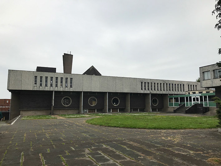
The brutalist library, by the local practice Paterson Macaulay and Owens is recently listed to Grade 2 status but features on the Liverpool Echo top ten Ugly Wirral, worst buildings.
‘Public library, civic rooms and hall. Designed from 1965, built 1967-71 by architects' practice, Paterson, Macauley and Owens of Bebington; the library opened April 1971. Formally opened July 1971 by the Duchess of Kent. Reinforced concrete frame on piled foundations, dark blue-brown facing bricks to the lower floors and pre-cast slabs with exposed aggregate surface of white Skye marble on the first floor, ribbed concrete plinth, dark brown tiles to pyramidal roof light on flat roof of library’ – sosbrutalism.org